3.1 Setting the Scene: Renewable Integration in the U.S. Over Time
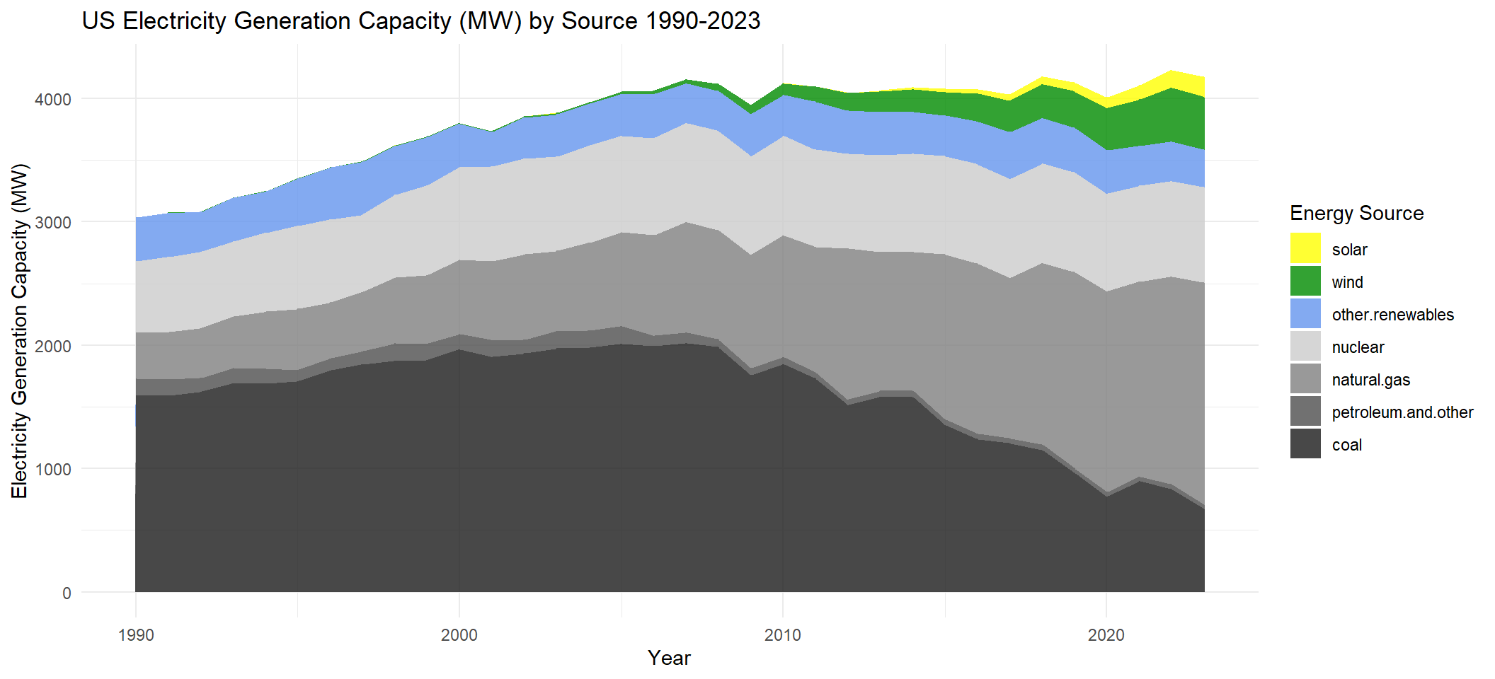
Understanding the trajectory of U.S. electricity generation over the past three decades provides context for the challenges and opportunities presented by renewable energy integration. The plot below serves as the foundation of our analysis, showing the shift in energy sources from 1990 to 2023. The total area adds up to the country’s total generation capacity in any given year. It highlights the following:
The decline of coal and petroleum-based generation.
The rise of natural gas.
The rapid growth of intermittent renewables (wind and solar), especially in the past decade.
The consistency of other renewables, which include hydroelectric, geothermal, and biomass.
We focus this analysis on wind and solar electricity generation because they provide clean but intermittent energy (after all, we can’t control when the wind is blowing and the sun is shining!). As the U.S. works to reduce carbon emissions and combat climate change, the grid will be more reliant on these intermittent energy sources, so understanding their impact on grid reliability is crucial.
Code
us_gen_data <-read.csv("US_generation.csv")colnames(us_gen_data)[1] <-"Year"us_gen_data <- us_gen_data |>filter(Year >=1990)data1_long <- us_gen_data |>select(Year, wind, solar, `coal`, `natural.gas`, `nuclear`, `other.renewables`, `petroleum.and.other`) |>pivot_longer(cols =-Year, names_to ="Energy_Source", values_to ="Generation")# Set factor levels (wind and solar at the top)data1_long$Energy_Source <-factor(data1_long$Energy_Source, levels =c("solar","wind","other.renewables", "nuclear", "natural.gas","petroleum.and.other", "coal"))# Area Chartggplot(data1_long, aes(x = Year, y = Generation, fill = Energy_Source)) +geom_area(alpha =0.8, position ="stack") +scale_fill_manual(values =c("coal"="gray10", "natural.gas"="gray50", "nuclear"="gray80", "other.renewables"="cornflowerblue", "petroleum.and.other"="gray30","wind"="green4","solar"="yellow")) +labs(title ="US Electricity Generation Capacity (MW) by Source 1990-2023",x ="Year",y ="Electricity Generation Capacity (MW)",fill ="Energy Source") +theme_minimal()
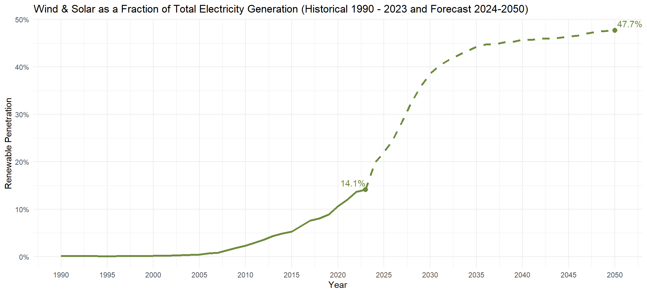
The plot above may give the impression that wind and solar currently contribute only a modest portion to the U.S. energy mix. However, when we plot their share of the country’s total electricity generation from 1990 to 2023, we see a significant growth trajectory. Starting from near zero contribution in the 1990s, wind and solar now account for 14.1% of total generation as of 2023. This trend is expected to accelerate significantly in the coming decades. According to EIA forecasts, wind and solar are projected to reach nearly 50% of total electricity generation by 2050.
This “Wind & Solar as a Fraction of Total Electricity Generation” metric measures the share of electricity generation coming from intermittent sources, and is often referred to as a percentage value called “Renewable Penetration”.
Code
# Add a new column to calculate the fraction of wind + solar generationdata2 <- us_gen_data |>mutate(Total_Generation = wind + solar + coal + natural.gas + nuclear + other.renewables + petroleum.and.other,Wind_Solar_Fraction = (wind + solar) / Total_Generation )# Find the last data pointlast_point <- data2 |>filter(Year ==max(Year))# Load and prepare the forecast data in Rforecast <-read.csv("Renewable_Energy_Forecast.csv") |>select(Year, Solar_Wind_Fraction) |>rename(Solar_Wind_Fraction = Solar_Wind_Fraction)# Combine the historical and forecast data for plottingcombined_data <-bind_rows( data2 |>select(Year, Wind_Solar_Fraction) |>rename(Fraction = Wind_Solar_Fraction), forecast |>rename(Fraction = Solar_Wind_Fraction))# Find the last data pointlast_point2 <- forecast |>filter(Year ==max(Year))# Plot with the forecastggplot(data2, aes(x = Year, y = Wind_Solar_Fraction)) +geom_line(color ="darkolivegreen4", linewidth =1.2) +geom_line(data = forecast, aes(x = Year, y = Solar_Wind_Fraction),color ="darkolivegreen4", linetype ="dashed", linewidth =1.2) +geom_point(data = last_point, aes(x = Year, y = Wind_Solar_Fraction), size =2.5, color ="darkolivegreen4") +geom_text(data = last_point, aes(label = scales::percent(Wind_Solar_Fraction, accuracy =0.1)),vjust =-0.5, hjust =1, color ="darkolivegreen4") +geom_text(data = forecast |>filter(Year ==2050),aes(x = Year, y = Solar_Wind_Fraction,label = scales::percent(Solar_Wind_Fraction, accuracy =0.1)),vjust =-0.5, hjust =-0.1, color ="darkolivegreen4") +geom_point(data = last_point2, aes(x = Year, y = Solar_Wind_Fraction), size =2.5, color ="darkolivegreen4") +labs(title ="Wind & Solar as a Fraction of Total Electricity Generation (Historical 1990 - 2023 and Forecast 2024-2050)",x ="Year",y ="Renewable Penetration") +theme_minimal() +scale_y_continuous(labels = scales::percent_format())+scale_x_continuous(breaks =seq(1990, 2050, by =5))
3.2 Grid Reliability
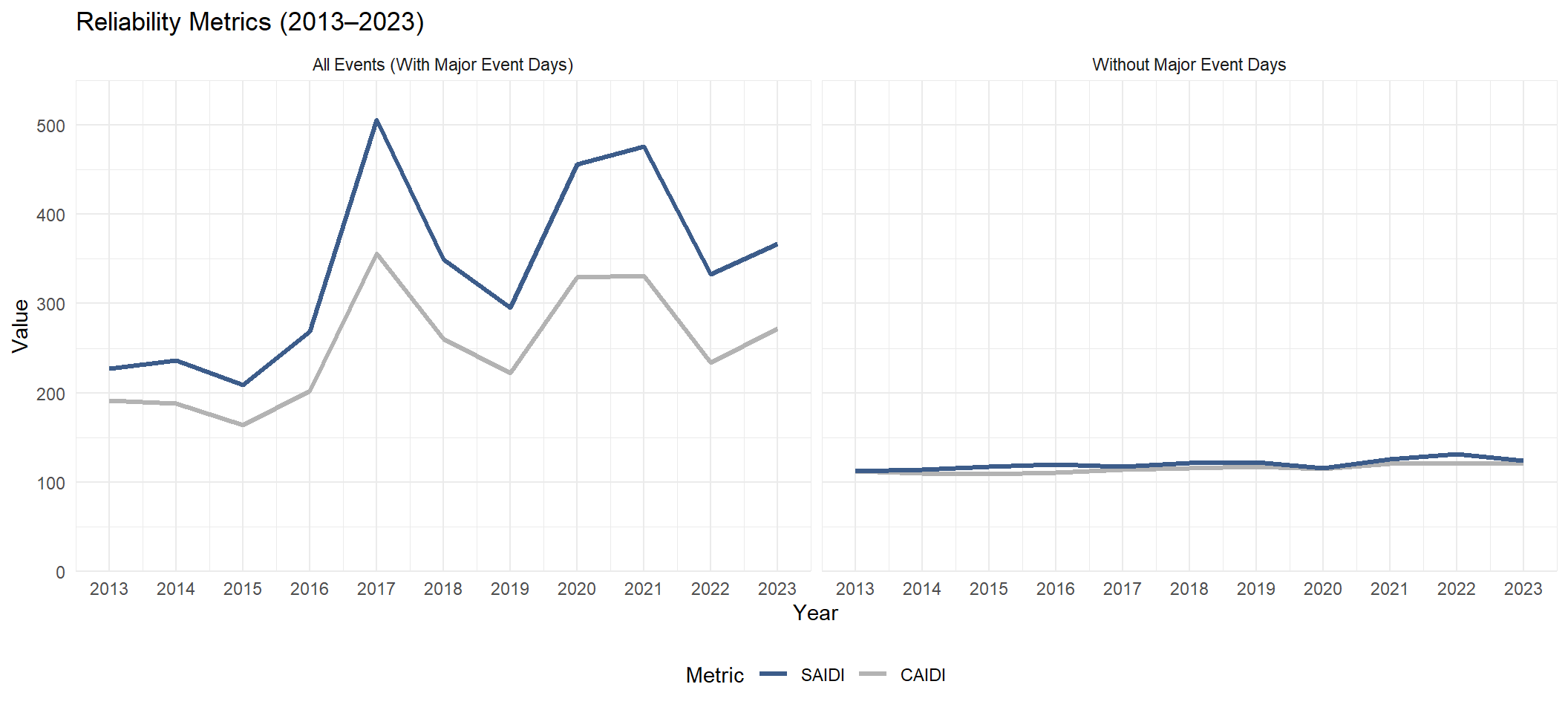
Grid reliability ensures that electricity is consistently available to meet the needs of homes, businesses, and critical services. As the U.S. transitions to a cleaner energy grid, understanding renewable energy’s impact on reliability is very important. The two key metrics the EIA uses to measure grid reliability are CAIDI and SAIDI, which help quantify the frequency and duration of power outages experienced by consumers:
CAIDI: Customer Average Interruption Duration Index. It is average number of minutes it takes to restore non-momentary electric interruptions.
SAIDI: System Average Interruption Duration Index. It is the minutes of non-momentary electric interruptions, per year, the average customer experienced.
Higher CAIDI and SAIDI values indicate a less reliable grid where interruptions/outages are either more frequent, take longer to restore, or both.
In the plot below, the comparison of reliability metrics on the left (including major events) and the right (excluding major events) demonstrates a relationship between grid reliability and “major event days”, described by the EIA as “any day that exceeds a daily SAIDI threshold”. When all major events are included, the plot shows significant spikes in some years: 2017, 2020, and 2021. Conversely, when major events are excluded, the metrics remain relatively stable over time, suggesting that the underlying reliability of the grid is not significantly affected by increasing renewable energy penetration, and is rather driven by the occurrence of these major events that we investigate in section 3.5.
Code
t1_reliability <-read.csv("T1_Reliability.csv")t1_reliability <- t1_reliability |>filter(`Event_Category`%in%c("IEEE_All_Events", "IEEE_No_Major_Events"))t1_reliability$Year <-as.integer(t1_reliability$Year)# Reshape the data to a long format for plottingdata3_long <- t1_reliability |>pivot_longer(cols =c(SAIDI, CAIDI), names_to ="Metric", values_to ="Value")# Plot the line graph faceted by Event Categoryggplot(data3_long, aes(x = Year, y = Value, color = Metric)) +geom_line(linewidth =1.2) +scale_x_continuous(breaks =seq(2013, 2023, 1)) +scale_y_continuous(limits =c(0, 550), expand =c(0, 0)) +scale_color_manual(values =c("SAIDI"='#3c5c8a',"CAIDI"='gray70'),breaks =c("SAIDI","CAIDI")) +labs(title ="Reliability Metrics (2013–2023)",x ="Year",y ="Value",color ="Metric") +facet_wrap(~`Event_Category`,labeller =labeller(`Event_Category`=c("IEEE_All_Events"="All Events (With Major Event Days)","IEEE_No_Major_Events"="Without Major Event Days"))) +theme_minimal() +theme(legend.position ='bottom')
3.3 Is there any correlation/association between renewable penetration and grid reliability?
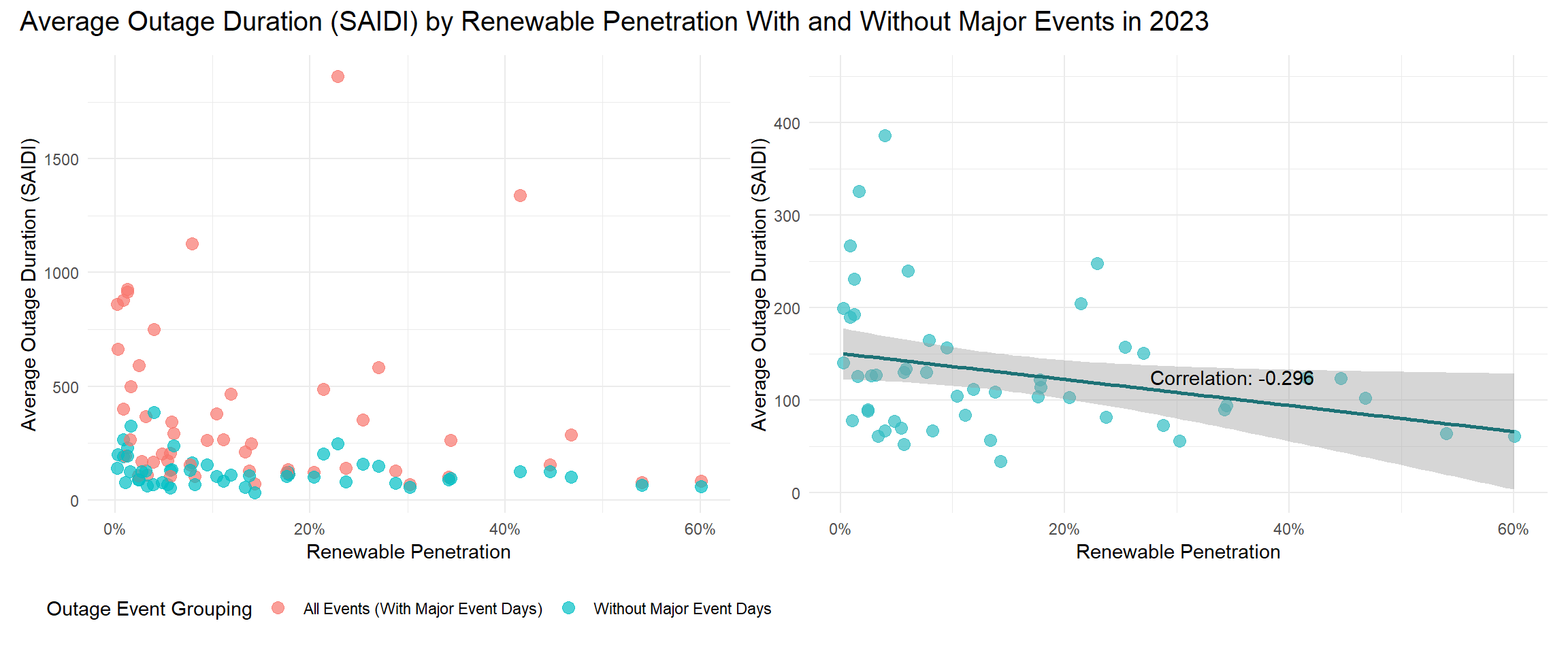
We explore the affect of renewable penetration on reliability metrics by plotting the former against the SAIDI reliability index by state. Since the wind doesn’t always blow and the sun doesn’t always shine, one might worry that the growth of renewable penetration, especially over the last decade, has caused higher levels of grid unreliability than other energy sources which operate independently of the weather.
However, no clear positive correlation appears in the scatter plot below when outage event type is not considered. A split in distribution becomes visible when points are grouped by whether SAIDI is calculated including or excluding major event/outage days. While both groups demonstrate a slightly negative correlation, the group excluding major event days shows the stronger relationship: an increase in renewable penetration correlates with a decrease in average outage duration (SAIDI). This suggests that the country’s increased dependency on wind and solar might indeed not relate to higher unreliability of the grid.
Code
# Load reliability metrics (SAIDI) from 2013-2023 by statet4_rbs <-suppressMessages(read_csv("T4_ReliabilityByState.csv"))# Pivot longer by state and filter to IEEE All Eventsdata_rbs <- t4_rbs |>pivot_longer(cols =c('CT':'HI'),names_to ='state', values_to ='SAIDI') |>filter(Method =='IEEE', Event_Grouping =='All Events (With Major Event Days)')# Create 2023-only version with major event daysrbs_2023 <- data_rbs |>filter(Census_Division =='2023') |>select(state, SAIDI)# Create 2023-only version without major event daysrbs_2023_no_major <- t4_rbs |>pivot_longer(cols =c('CT':'HI'),names_to ='state', values_to ='SAIDI') |>filter(Method =='IEEE', Event_Grouping =='Without Major Event Days', Census_Division =='2023') |>select(state, SAIDI)# Load renewable penetration from 2023 by statestate_generation_2023 <-suppressMessages(read_csv('state_generation_2023.csv'))# Calculate generation by energy type by statesuppressMessages(state_generation_2023 <- state_generation_2023 |>group_by(state, source) |>summarise(generation =sum(generation)))# Derive renewable penetration from generationstate_pen_2023 <- state_generation_2023 |>pivot_wider(names_from = source, values_from = generation, values_fill =0) |>mutate(total_gen = coal + natural.gas + other.renewables + petroleum.and.other + solar + wind + nuclear,wind_solar = wind + solar,w_s_pen = wind_solar/total_gen)# Create combo dataset that disregards event grouping typerbs_2023_combo <- t4_rbs |>pivot_longer(cols =c('CT':'HI'),names_to ='state', values_to ='SAIDI') |>filter(Method =='IEEE', Event_Grouping %in%c('Without Major Event Days','All Events (With Major Event Days)'), Census_Division =='2023') |>select(state, SAIDI, Event_Grouping)# Join reliability (SAIDI) with renewable penetration by state with major event daysscatter_state_2023 <- state_pen_2023 |>left_join(rbs_2023, by ='state') |>select(state, w_s_pen, SAIDI)# Join reliability (SAIDI) with renewable penetration by state without major event daysscatter_state_2023_no_major <- state_pen_2023 |>left_join(rbs_2023_no_major, by ='state') |>select(state, w_s_pen, SAIDI)# Join reliability (SAIDI) with renewable penetration by state for combo version scatter_state_2023_combo <- state_pen_2023 |>left_join(rbs_2023_combo, by ='state') |>select(state, w_s_pen, SAIDI, Event_Grouping)# Store scatter plot colored by event grouping typeplot2 <-ggplot(data = scatter_state_2023_combo, mapping =aes(x = w_s_pen, y = SAIDI, color = Event_Grouping)) +geom_point(alpha = .7, size =3, na.rm =TRUE) +# coord_cartesian(ylim = c(0,1850)) + scale_x_continuous(labels = scales::percent_format()) +labs(x ="Renewable Penetration",y ="Average Outage Duration (SAIDI)",color ="Outage Event Grouping") +theme_minimal() +theme(legend.position ='bottom')# Get rid of Hawaii (NA) to calculate correlation coefficientno_hawaii <-scatter_state_2023_no_major |>filter(state !='HI')# Calc corr coeffcc <-cor(no_hawaii$w_s_pen, no_hawaii$SAIDI)# Store second scatter plot, a version zoomed in on without major event days that includes a regressionplot3 <-ggplot(data =filter(scatter_state_2023_combo, Event_Grouping =='Without Major Event Days'), mapping =aes(x = w_s_pen, y = SAIDI)) +geom_point(alpha = .7, size =3, color ='#31bdc3', na.rm =TRUE) +geom_smooth(data =filter(scatter_state_2023_combo, Event_Grouping =='Without Major Event Days'),formula = y ~ x,method ='lm',color ='#1d7276',na.rm =TRUE) +annotate("text", x = .35, y =125, label =paste("Correlation:", round(cc, 3))) +coord_cartesian(ylim =c(0, 450)) +scale_x_continuous(labels = scales::percent_format()) +labs(x ="Renewable Penetration",y ="Average Outage Duration (SAIDI)") +theme_minimal()# Patch plots togethersuppressWarnings(plot2 + plot3 +plot_layout(widths =c(2, 2.3)) +plot_annotation(title ='Average Outage Duration (SAIDI) by Renewable Penetration With and Without Major Events in 2023',theme =theme(plot.title =element_text(size =15))))
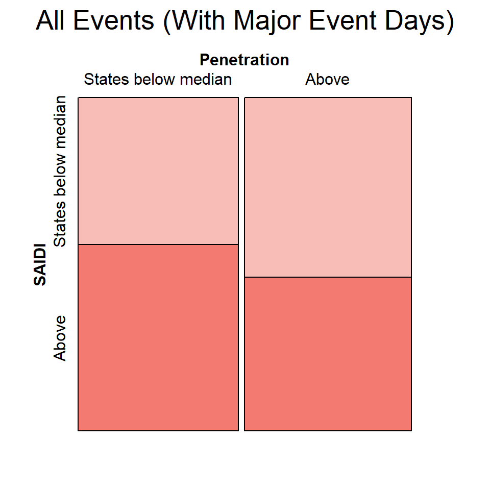
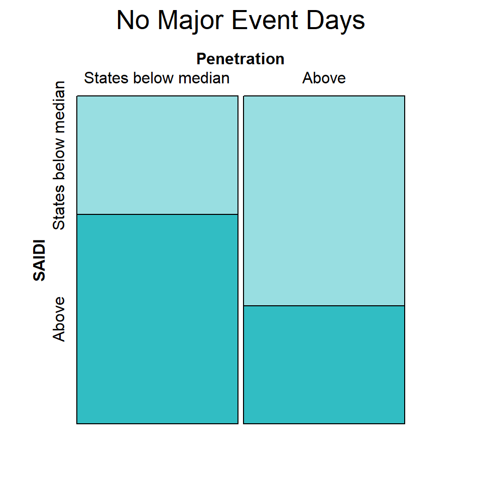
Visualizing this conclusion with mosaic plots further highlights the variables’ negative correlation, even when major event days were included. (Since both renewable penetration and reliability metrics are continuous variables, we first set a threshold at their respective medians and within each event grouping to then sort states into categories.) Notice that the plots similarly exhibit an inverse relationship between renewable penetration and outage duration regardless of major event days.
Code
# Store median of renewable penetration and of SAIDI with major eventsall_events_pen_med <-median(scatter_state_2023$w_s_pen)all_events_SAIDI_med <-median(scatter_state_2023$SAIDI)# Prep data with major events for mosaic plotall_events_mos <- scatter_state_2023 |>mutate(Penetration =factor(if_else(w_s_pen >= all_events_pen_med, 'Above', 'States below median'),levels =c('States below median','Above')),SAIDI =factor(if_else(SAIDI >= all_events_SAIDI_med, 'Above', 'States below median'),levels =c('States below median','Above'))) |>select(-w_s_pen)# Store median of renewable penetration and of SAIDI without major eventsno_major_pen_med <-median(no_hawaii$w_s_pen)no_major_SAIDI_med <-median(no_hawaii$SAIDI)# Prep data without major events for mosaic plotno_major_mos <- no_hawaii |>mutate(Penetration =factor(if_else(w_s_pen >= no_major_pen_med, 'Above', 'States below median'),levels =c('States below median','Above')),SAIDI =factor(if_else(SAIDI >= no_major_SAIDI_med, 'Above', 'States below median'),levels =c('States below median','Above'))) |>select(-w_s_pen)# Create mosaic plots for both event grouping typesmosaic(SAIDI ~ Penetration, all_events_mos, direction =c("v", "h"),main ="All Events (With Major Event Days)",highlighting_fill =c('#f37a717F','#f37a71'))
Code
mosaic(SAIDI ~ Penetration, no_major_mos, direction =c("v", "h"),main ='No Major Event Days',highlighting_fill =c('#31bdc37F','#31bdc3'))
The information provided by both plot types not only contradicts worry that renewable energy, dependent on intermittent sources, takes a toll on reliable energy generation within the US. It also suggests the possibility that increased renewable energy positively affects the grid. Moreover, the difference in correlation when major event days are included or excluded leads us to wonder if another factor is at play.
3.4 Are there geographic trends?
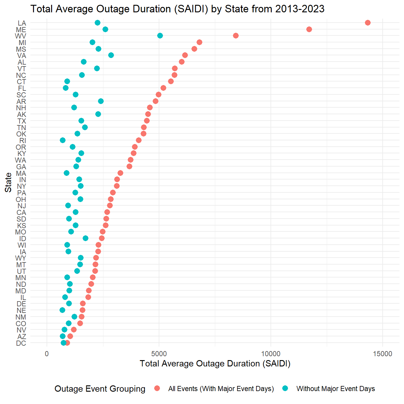
To begin exploring a second factor, it helps us to know which states had the highest amounts of interruptions across the last decade, no matter the reason. The Cleveland dot plot below shows the sum of SAIDI by state from 2013 to 2023, which reveals the states with the least reliable energy generation at the top. (Hawaii is excluded for missing data.)
Louisiana, Maine, and West Virginia float to the top when all events are considered but with a key distinction. West Virginia’s two sums are significantly closer than those of Louisiana and Maine, suggesting different reasons behind their outages. We imagine that West Virginia may simply have a problematic grid, whereas Louisiana and Maine may experience volatile, external impacts. The next step is to search for that volatility.
Code
# Sum SAIDI across the decade of data with all major eventsdecade_SAIDI_all <- data_rbs |>filter(state !='HI') |>group_by(state) |>summarise(SAIDI_all =sum(SAIDI))# Sum SAIDI across the decade of data without major eventsdecade_SAIDI_nm <- t4_rbs |>pivot_longer(cols =c('CT':'HI'),names_to ='state', values_to ='SAIDI') |>filter(Method =='IEEE', Event_Grouping =='Without Major Event Days', state !='HI') |>group_by(state) |>summarise(SAIDI_nm =sum(SAIDI))# Join datasetsbar <- decade_SAIDI_all |>left_join(decade_SAIDI_nm, by ='state')# Order states by SAIDI with all major eventsbar$state <-reorder(bar$state, bar$SAIDI_all)# Create Cleveland dotplot colored by event grouping typeggplot(bar, mapping =aes(y = state, x = SAIDI_all, color ='All Events (With Major Event Days)')) +geom_point(size =3) +geom_point(size =3, mapping =aes(x = SAIDI_nm, color ='Without Major Event Days')) +scale_x_continuous(limits =c(0, 15000)) +labs(x ='Total Average Outage Duration (SAIDI)',y ='State',title ='Total Average Outage Duration (SAIDI) by State from 2013-2023',color ='Outage Event Grouping') +theme_minimal() +theme(legend.position ='bottom')
The high SAIDI years from the grid reliability metrics line graph provide an efficient starting place for our search. We want to investigate if any states stand out when we focus on those years and include all events. In other words, our goal is to identify which states were most impacted by “Major Events” in high-disruption years.
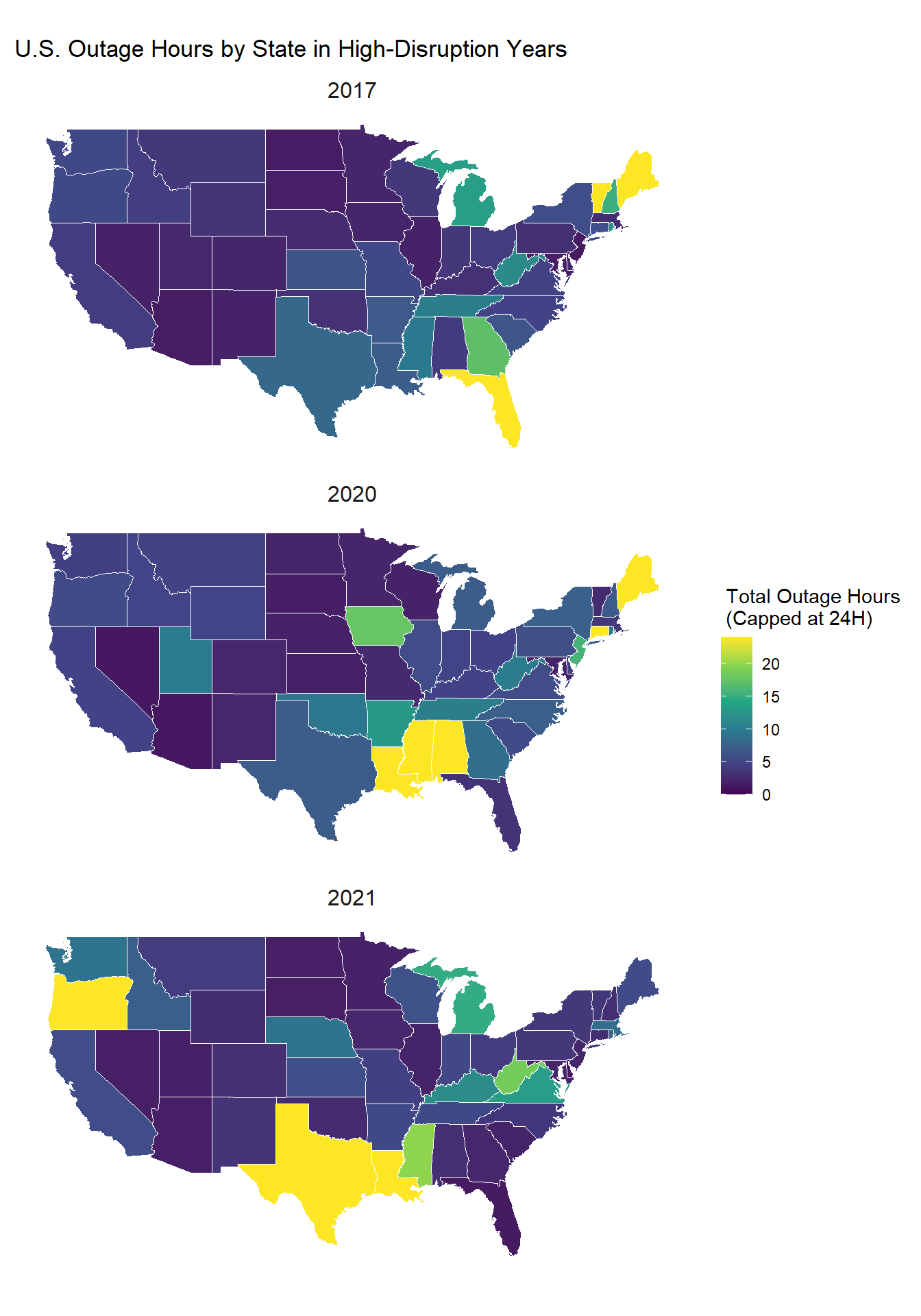
Mapping total outage hours across high-disruption years (2017, 2020, 2021) highlights the states disproportionately affected by outages. We suspect this is due to severe, regional weather events, such as winter storms and hurricanes, underscoring the intersection of climate resilience and energy grid reliability.
In 2017: Maine, Vermont, and Florida stand out
In 2020: Maine, Connecticut, Mississippi, Alabama, and Louisiana stand out
In 2021: Texas, Oregon, and Louisiana stand out
To provide a clearer perspective, the outage values are capped at 24 hours, which represents a cumulative full day of outages over the course of one year. This approach uncovers states with particularly disruptive events while maintaining focus on severe reliability issues. Without capping, we risk losing important granularity since excessively high values from outlier events could overshadow state-by-state comparisons and trends.
Code
data5 <-read.csv("T4_ReliabilityByState.csv")# State abbreviations and full namesstate_abbrev <-tibble(state_full =tolower(state.name),state_abbrev = state.abb)filtered_data5 <- data5 |>filter(Method =="IEEE", Event_Grouping =="All Events (With Major Event Days)", Census_Division %in%c(2017, 2020, 2021),!is.na(Census_Division)) |>select(-Method, -Event_Grouping, -HI, -AK)# Reshape the data into a long formatlong_data5 <- filtered_data5 |>pivot_longer(cols =-Census_Division, names_to ="state_abbrev", values_to ="value")# Convert values from minutes to hours and cap at 24 hourslong_data5 <- long_data5 |>mutate(value =pmin(value /60, 24)) # Load state geometriesus_states <-st_as_sf(maps::map("state", plot =FALSE, fill =TRUE))us_states <- us_states |>mutate(state_full = ID) |>left_join(state_abbrev, by =c("state_full"="state_full")) # Merge data with geometriesmapped_data <- us_states |>left_join(long_data5, by =c("state_abbrev"="state_abbrev")) |>filter(state_abbrev !="DC")# Plot the map with facets for Census Divisionggplot(data = mapped_data) +geom_sf(aes(fill = value), color ="white", lwd =0.2) +scale_fill_viridis_c(option ="viridis", na.value ="gray80", limits =c(0, 24)) +labs(title ="U.S. Outage Hours by State in High-Disruption Years",fill =" Total Outage Hours\n (Capped at 24H)") +facet_wrap(~ Census_Division, ncol =1) +# Facet by Census Divisiontheme_minimal() +theme(axis.text =element_blank(),axis.ticks =element_blank(),panel.grid =element_blank(),strip.text =element_text(size =12) )
3.5 Confirming that these standouts are caused by extreme weather events
Each high-disruption state and year can be linked to an extreme weather event, such as a winter storm, hurricane or tornado. By year, the events are as follows:
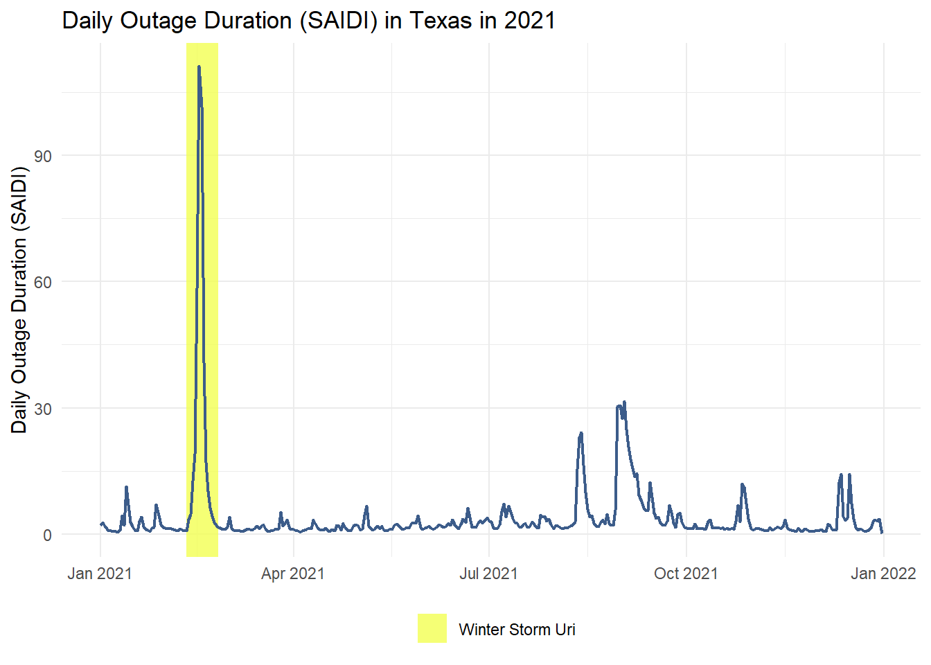
The news articles and websites linked above tie these weather events to power outages, and the plot below confirms that daily outage minutes spike in times of extreme weather. The plot shows a daily outage metric in Texas over the course of 2021, with the dates of Winter Storm Uri (February 10-25) highlighted in yellow. As we expected, the highest number of outage minutes, by a large measure, lands within these storm days.
Code
# Read the datasaidi_data <-read.csv("Texas_Daily_SAIDI.csv")# Convert Date column to Date typesaidi_data$Date <-as.Date(saidi_data$Date, format ="%m/%d/%y")highlight_period <-data.frame(xmin =as.Date("2021-02-10"),xmax =as.Date("2021-02-25"),ymin =-Inf,ymax =Inf,label ="Winter Storm Uri")# Plot the dataggplot(saidi_data, aes(x = Date, y = Daily.SAIDI)) +geom_rect(data = highlight_period, aes(xmin = xmin, xmax = xmax, ymin = ymin, ymax = ymax, fill = label),alpha =0.8, inherit.aes =FALSE) +scale_fill_manual(name ="", values =c("Winter Storm Uri"="#f3ff52")) +geom_line(color ="#3c5c8a", linewidth = .75) +labs(title ="Daily Outage Duration (SAIDI) in Texas in 2021",x =NULL,y ="Daily Outage Duration (SAIDI)") +theme_minimal() +theme(legend.position ="bottom")
3.6 Does outage duration differ among types of severe weather?
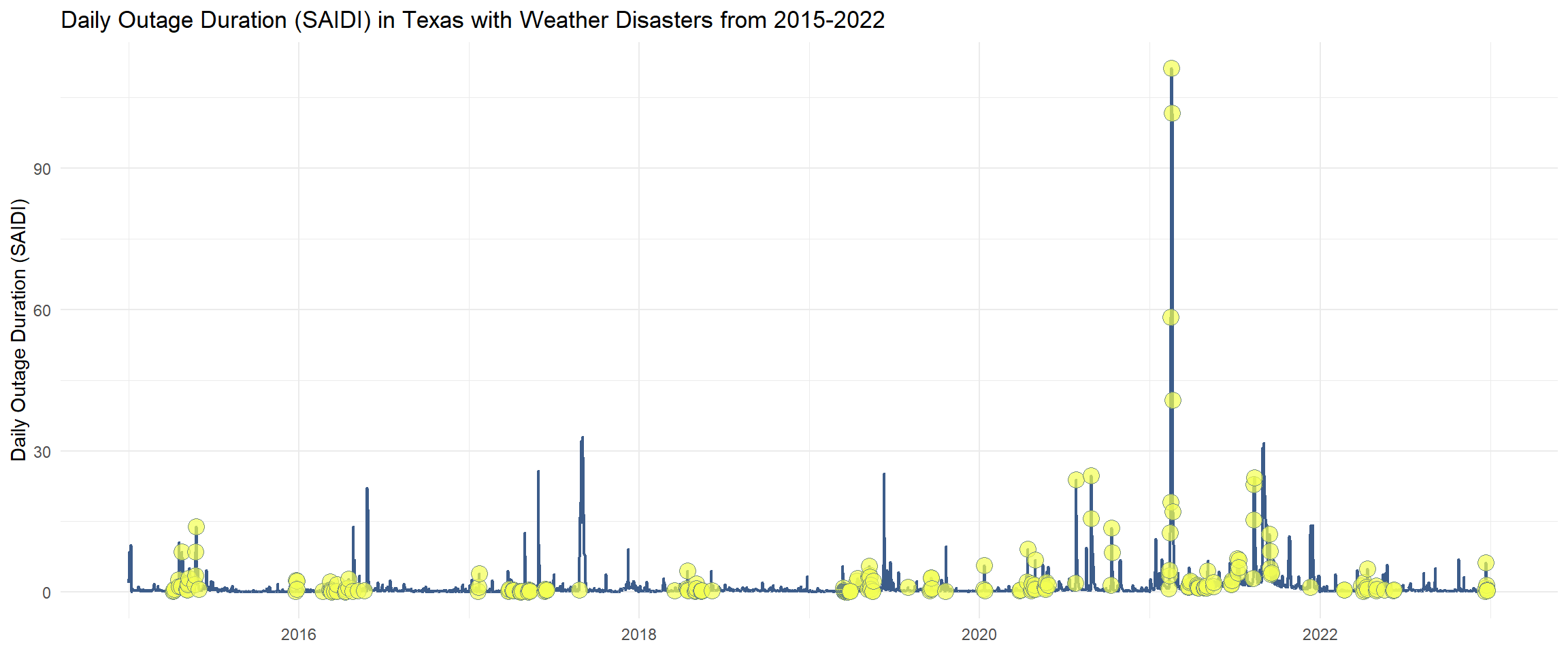
In fact, by looking at Texas across multiple years alongside all its severe weather events within the same time frame, we can analyze if there are any differences among the effects on SAIDI by types of severe weather. (Texas experienced nearly every weather disaster type listed by the NOAA, so it suffices to view Texas alone.) The plot below shows other daily SAIDI peaks, many of which are covered or initiated by weather events in yellow. Notice that the location patterns of the weather events relative to the peaks are not the same, nor are the size of the peaks they cover.
Code
# Load Texas's daily reliability datatexas <-suppressMessages(read_csv("Texas_Daily_SAIDI_2015_2022.csv"))# Adjust column nametexas <- texas |>mutate(date = Date) |>select(-Date)# Load Texas's weather disaster data from the same time periodweather <-suppressMessages(read_csv('events-TX-2015-2022.csv'))# Join datasetsweather_SAIDI <- weather |>left_join(texas, by ='date')# Plot daily SAIDI with all weather disasters markedggplot(weather_SAIDI, aes(x = date, y = Daily.SAIDI)) +geom_line(data = texas,aes(x = date, y = Daily.SAIDI),linewidth = .75,color ='#3c5c8a') +geom_point(size =4,shape =21,fill ='#f3ff52',color ='#3c5c8a',alpha = .7,na.rm =TRUE) +coord_cartesian(xlim =c(as.Date('2015-01-01'),as.Date('2022-12-31'))) +labs(title ='Daily Outage Duration (SAIDI) in Texas with Weather Disasters from 2015-2022',y ='Daily Outage Duration (SAIDI)') +theme_minimal() +theme(axis.title.x =element_blank())
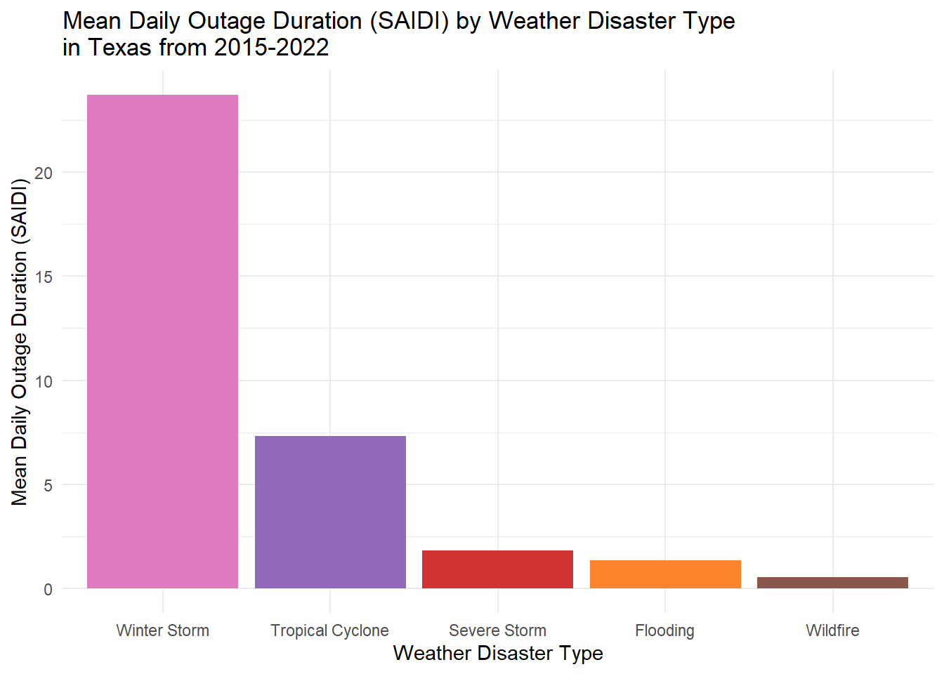
By calculating the mean daily SAIDI by weather disaster type, we learn that, at least on Texas’s power grid, different disasters have historically affected energy generation by differing levels of severity. Shown below, winter storms were by far the most interruptive for Texas over this time period, likely due to extreme Winter Storm Uri. The second highest interrupter was tropical cyclones, and the other three disaster types of severe storms, flooding, and wildfires trailed behind.
Code
# Calculate mean daily SAIDI by disastermeans <- weather_SAIDI |>select(disaster, Daily.SAIDI) |>filter(!is.na(Daily.SAIDI)) |>group_by(disaster) |>summarise(mean_SAIDI =mean(Daily.SAIDI))# Order weather disaster types by mean SAIDImeans$disaster <-fct_rev(reorder(means$disaster, means$mean_SAIDI))# Plot meansggplot(means, mapping =aes(x = disaster, y = mean_SAIDI, fill = disaster)) +geom_col() +scale_fill_manual(values =c("Winter Storm"="#de7ac0", "Tropical Cyclone"="#9268ba", "Severe Storm"="#d03330", "Flooding"="#fa832c", "Wildfire"="#8a574d")) +labs(title ='Mean Daily Outage Duration (SAIDI) by Weather Disaster Type\nin Texas from 2015-2022',x ='Weather Disaster Type',y ='Mean Daily Outage Duration (SAIDI)') +theme_minimal() +theme(legend.position ='none')